From Visual Clutter to Clear Hierarchy: A Footer Redesign
A case study of the BoxLang footer redesign — how seven UX principles (whitespace, visual hierarchy, recognition over recall, consistency, grouping, intentional CTAs, progressive disclosure) transformed visual clutter into clear information hierarchy without removing content.
A footer is easy to overlook.
It sits at the bottom of the page, often treated as a place to dump navigation links, social media icons, legal information, and a newsletter form. But when a website has a large amount of content, the footer becomes an important information architecture problem.
While redesigning the BoxLang footer, I used the task as an opportunity to explore how the same information could be made easier to scan, how visual hierarchy could be strengthened, and how the cognitive load created by the original layout could be reduced.
The goal wasn't simply to make the footer look better. It was to understand how whitespace, visual hierarchy, recognition, consistency, grouping, and responsive design could make the existing information easier to understand.
The problem: too much information competing for attention

The original footer contained all the necessary information, but almost everything had similar visual weight.
The logo, contact information, newsletter, navigation links, social networks, and legal information were competing within the same space.
From a UX perspective, the problem wasn't the amount of content itself. It was how that content was organized and presented.
When multiple elements have similar visual weight, users have to spend more effort determining:
- What belongs together?
- Where should I look first?
- Which links are related?
- What is the most important action?
- Where does one section end and another begin?
This is where visual hierarchy and whitespace become functional UX tools rather than purely aesthetic decisions.
1. Whitespace reduces cognitive load
One of the biggest changes was simply giving the content more room to breathe.
The original footer compressed many elements into relatively tight areas. In the redesign, larger gaps separate the major content groups while related elements remain close together.
This follows a fundamental Gestalt principle: proximity helps users understand relationships.
The goal isn't to maximize the amount of information displayed. It's to make the information easier to parse.
More whitespace creates clearer boundaries between:
- Brand and contact information
- Newsletter
- Navigation categories
- Social links
- Legal information
The footer becomes easier to scan without removing content.
2. Visual hierarchy makes the information scannable
The redesign introduces a clearer hierarchy between headings, links, and secondary information.
Instead of treating every element equally, the structure communicates importance through:
- Typography
- Spacing
- Grouping
- Alignment
- Section separation
The navigation categories were already present in the original footer. The redesign focused on making their hierarchy more apparent through consistent heading treatment, spacing, and a clearer distinction between primary headings and secondary links.
This connects directly with Nielsen Norman Group's Aesthetic and Minimalist Design heuristic: interfaces should avoid information that competes with relevant content.
Minimalism doesn't mean having less content.
It means making the right content easier to perceive.
3. Recognition instead of recall
The navigation already contained categories such as:
Discover BoxLang
Learn & Explore
Get BoxLang
Get Involved
The redesign didn't introduce these categories. Instead, it strengthened their visual role within the footer.
The consistent treatment of category headings and their links makes the existing structure easier to recognize.
Users don't need to mentally interpret a long list of unrelated links. The category labels provide context before they read the individual options.
For example, seeing "Documentation" under "Learn & Explore" immediately establishes a relationship that would be less obvious in a flat list.
This is also an information architecture decision: the navigation isn't just being displayed; its existing classification is being made more apparent through visual hierarchy.
4. Consistency creates predictable interaction
The new footer establishes consistent patterns across navigation groups.
Each column follows the same visual structure:
Category → links → whitespace → next category
This supports Nielsen's Consistency and Standards heuristic.
Once users understand one navigation group, they can immediately understand the others.
Consistency is especially valuable in a footer because users often scan it quickly rather than reading it line by line.
5. Grouping reduces visual complexity
The original footer had the right information, but its structure didn't communicate the relationships between all those elements strongly enough.
The redesign creates distinct visual regions:
Brand / Contact / Newsletter
              +
     Navigation Groups
              ↓
        Social Links
              ↓
       Legal Information
The information itself wasn't dramatically reduced. Instead, the visual relationships between the existing elements became clearer.
The footer is no longer perceived as one large block of content. It becomes a collection of smaller, understandable sections.
That's an important UX principle: complexity can often be reduced through organization rather than reduction of content.
6. The newsletter becomes an intentional action
The newsletter form remains within the brand and contact area, but its visual treatment becomes more intentional.
The form doesn't need to compete with every other element in the footer.
The heading, input, and button establish a clearer relationship, while the CTA maintains a distinct visual emphasis from the secondary navigation links.
This is a small example of how visual hierarchy can support conversion without introducing unnecessary visual noise.
7. Designing the footer as a system
Another important decision was to think about the footer beyond a single screenshot.
The desktop version establishes the information hierarchy, but the structure is also designed to support responsive behavior.
On smaller screens, the navigation groups can become stacked sections or accordions rather than simply shrinking the desktop layout.
This is where progressive disclosure becomes useful.
Instead of presenting every link simultaneously on a small screen, users can access the category they need while keeping the initial interface compact.
The desktop and mobile experiences can therefore share the same information architecture while adapting the presentation to the available space.
The result
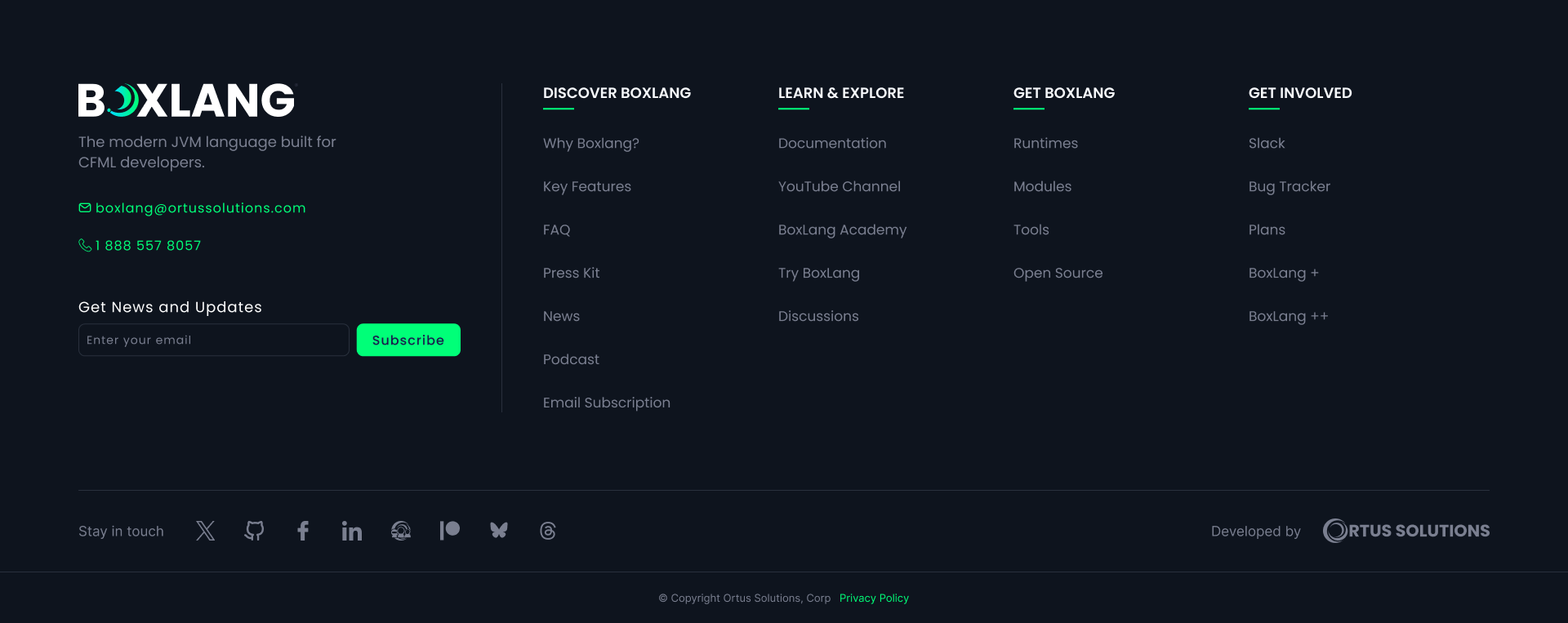
The redesign didn't require removing the content that already existed.
It required asking a different question:
How can the same information be made easier to understand?
The answer was a combination of information architecture, visual hierarchy, whitespace, proximity, consistency, recognition, and responsive design.
The final footer is visually simpler, but the real improvement is structural.
It communicates relationships between pieces of information more clearly, gives important elements appropriate visual weight, and makes the entire section easier to scan.
For me, this is an important distinction between UI styling and UX design.
A redesign isn't successful simply because the new version looks better.
It should also make the interface easier to understand, easier to navigate, and more intentional.
And sometimes, the best way to achieve that isn't to add anything.
It's to give the existing information the space and structure it needs to make sense.
UX/UI concepts: Information Architecture, Visual Hierarchy, Whitespace, Cognitive Load, Gestalt Principles, Recognition vs. Recall, Progressive Disclosure, Responsive Design, Nielsen's Usability Heuristics, Conversion-focused Design.
Role: Product Designer + Frontend Developer